Final Reflection
- Lauren Avero

- Jun 6, 2019
- 3 min read
This task was a insight into the importance of text setting and the way it becomes an expressive identity. Its something people may look past but in an instant when something is wrong its noticed.
Originally the booklet brief itself was quite confusing, the elements required were all so different and didn't make sense to put together. I found it particularly hard to incorporate the monograms in the booklet as the other elements have no link, however overtime the booklet just became a portfolio for the monograms and ransom quotes whilst matching the theme of the booklet.
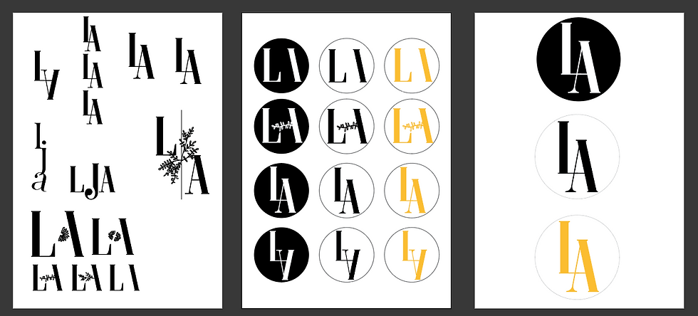
The Monogram was interesting to create as it linked to my personality, though also taking in the potential to flow, look consistent and is legible. I created many examples after drawing a few designs on paper to explore the different options for my initials 'L.A'. Sticking to my more elegant more consistent side rather then my loosey goosey personality I chose an elegant Serif type and created them in Illustrator.

It was very different to place so much emphasis on the type settings of the text rather then an image but it signified the importance of the concentrating on how the type becomes a form of expression for the context of the piece. It was a worthy challenge to avoid using pictures to tell the story and also avoiding using distracting shapes to fill in for images.
Being stuck on the what to include and the link these would have was also a difficult step but once a theme of colours was established so was the type setting which meant they linked. As I went gained layout ideas, I could see many people mixing type settings within their booklets, in my opinion I sometimes found this messy and many realistic booklets/magazines wouldn't extend from the already established margins and grids. The brief being so open however was difficult to determine which technique what suit the brief compositions.
The original design ideas were very bland and weren't capturing to the eye. The pull out text didn't represent the context of the type and it generally wasn't very appealing.
I decided to start again at a clean slate and sticking to a 3 column grid and margins I created type setting that was consistent whilst highlight certain parts of the text that help establish the purpose of the text.
The ransom quote had endless possibilities in regards to what background and the type used. However to keep it consistent with the rest of the elegance and simplicity,I chose to only include black letters on white background. This diverged my ransom quote from the rest of from what I had seen. This meant however that it may not be as appealing to the eye, a risk I was willing to take as i enjoyed the simplicity flow. The ransom background was scanned in as a tiff file and the original has a ripped edge, when placing this file in indesign I found a certain liking for placing 'Massimo Vignelli', the creator of the quote, behind the image. This created a an effect that the text is hiding behind the image. Quite metaphorically emphasising the fact that images can sometimes take over text.

Through the use of Indesign I have learned that it has a very functional, user-friendly process when creating a multipage booklet. Using master pages I was able to adjust the columns, margins and bleed for the booklet to be consistent whilst also adding pages numbers and text that remain identical on each page.
Using columns allowed for each page to be consistent and in line with each other this was key as the booklet theme was essentially consistency with pops of text to emphasise those points. I believe the design was clean and eligible but still had pops of colour to grasp attention and keep the audience’s attention.
Until Next Time, Live and Laugh,


Comments