
Blog 1 - Kinetic Type in title sequences
- Lauren Avero

- Mar 24, 2021
- 3 min read

The following analysis is a spotlight into how kinetic typography is used to reveal the title of a film during its opening sequence. The three sequences Altered States (1980), Dead Zone (1983) and Stranger Things (2016) all feature type based illustrative motifs which run alongside their audio tracks. These sequences are slowly paced to induce a sense of suspense which corelated to their movie genre.
Richard Greenberg designed both the Altered States and Dead Zone sequences. Greenberg was a motion graphics and main titles designer from Chicago who often used type both as structure and as obstruction, typographically setting the tone for the film’s motifs. In both these sequences, there is a steady recombining of the letters that make up the title which enter the screen, becoming a lens for the scene, constructing a uneasy and suspenseful tone for the viewers.

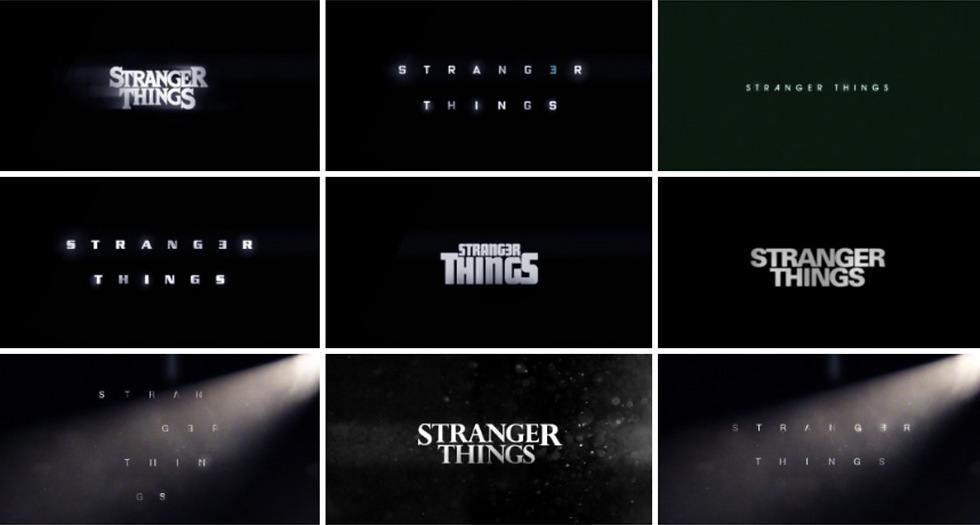
Unlike Altered States and Dead Zone which uses kinetic text over videography, the Stranger Things title sequence takes place in a black void. This sequence features large, disjointed letters drift through the void slowly assembling with their movement synced with its synth soundtrack.
“Today, text is no longer limited to static, spatial forms of communication; it can make use of time and motion. These added dimensions further enhance its communicative power.” (Krasner, 2013). The lack of video imagery in the Stranger Things sequence means it heavily relies upon tone, colour and line to communicate to the viewer. This format used combined abstract forms with motion and sound which was drawn from the experimental films produced by the Avant Garde movement.
Michelle Dougherty was the motion and graphic designer behind the Stranger Things sequence. She spoke of the process of creating the sequence understanding the feel that the directors were after “we really understood that they wanted this creepy feel to it. The disjointed type getting set along with the music imbues it with this real sense of unease. She also mentions the reference that they specifically referenced Greenbergs work, and that the kinetic typography will be truly crucial to get the right feel. Dougherty emphasises this importance by stating “A typeface is like an actor. Once you change the actor it’s a different thing.”
Jon Kranser expresses that “The role of expressive kinetic typography is to represent a concept in a visual format.” (Krasner, 2013) Though the sequence echoes the lead-ins of Altered States and Dead Zone, it was created 30+ years later and yet is able to recreate a tone of nostalgia whilst achieving the tone unease for its viewers showing the true power of kinetic type in motion.

All three sequences showcase how impactful the use of kinetic type was during the 1980s-1990s to be continuously used to this day (Krasner, 2013). Although different in specifics, each sequence combine the basic principles of design and more specifically referencing the typographical elements they featured the graphics timing synced with their audio, the movement of the objects and the panning of the camera all to which had a purpose in evoking a certain motif.
Bibliography -
Krasner, J (2013) Motion Graphic Design: Applied History and Aesthetics. Taylor & Francis Group, Oxford, UNITED KINGDOM.
Stranger Things [WWW Document] (2016) Art of the Title. URL: //www.artofthetitle.com/title/stranger-things/
Altered States [WWW Document] (2013) Art of the Title. URL: //www.artofthetitle.com/title/altered-states/
The Dead Zone [WWW Document] (2013) Art of the Title. URL: //www.artofthetitle.com/title/the-dead-zone/


Comments